The Ease of Flexbox
This past weekend I started back up rebuilding my photography site. I've been wanting to get it back up and running since I ended up taking it down several years ago. What I didn't realize was how well display: flex; works when laying out photos in nice rows.
I'm a little scared to really look at my old Next.js site and codebase to see how I laid out my photosets. The little I've seen seems to be, let's just say "hack-y". It doesn't matter how I was doing it, I am going to now do it better. I saw just enough while pulling the metadata from the photosets to grimace.
I do know how I want my new site to look. I was actually able to get the bulk of the homepage taken care of. I still have some optimizations I want to apply, but it looks to be in good shape.
The photosets, while I have a good idea how I want them to look, I wasn't sure how well I could get them to work in nicely regardless of the screen size. Enter my first attempt with using display: flex; on a row. It's pretty great.
First the CSS.
.photos {
  display: flex;
  flex-direction: column;
  gap: 8px;
}

.photos .row {
  display: flex;
  gap: 8px;
}

.photos .row img {
  min-width: 0;
}
Now the HTML.
<section class="photos">
<div class="row">
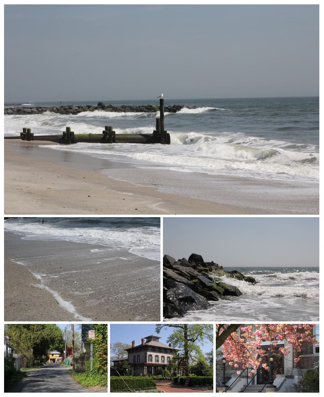
<img src="/images/photosets/2012-cape-may/2012-cape-may-01.jpg" alt="A seagull standing on a post over waves" />
</div>
<div class="row">
<img src="/images/photosets/2012-cape-may/2012-cape-may-02.jpg" alt="Waves rolling onto sand" />
<img src="/images/photosets/2012-cape-may/2012-cape-may-03.jpg" alt="Waves crashing against rocks" />
</div>
<div class="row">
<img src="/images/photosets/2012-cape-may/2012-cape-may-07.jpg" alt="A view down an alleyway with a yellow building in the background" />
<img src="/images/photosets/2012-cape-may/2012-cape-may-08.jpg" alt="A victorian mansion" />
<img src="/images/photosets/2012-cape-may/2012-cape-may-09.jpg" alt="Cape May city hall behind a blossoming cherry tree" />
</div>
</section>With that little bit of HTML and CSS, My photos neatly slot into either a single image, two, or three to a row! Desktop, mobile, in-between, it all looks good! The .photos section is a going up and down, while each .row goes left-to-right. They all have a gap of 8 pixels so it looks nice and evenly spaced. The min-width:0 applied to each image ensures that the images will shrink to fit in nicely.
I know flexbox has been around for a while now, but it still amazes me how much easier it makes things. Now the one caveat with this is that it assumes that all the photos in the row are the same dimensions. For my photography, that holds true. For others, maybe not so much. Either way, it's still far easier now than it was back when I first started digging into web design in the late 2000's. The web platform is amazing.